Projects
Life With Invisibility
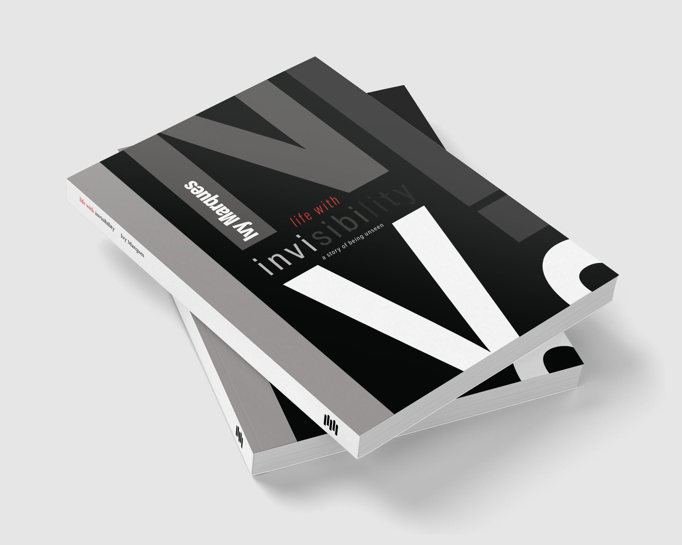
The Brief
Design a book cover for a series investigating superpowers from a cultural studies perspective, exploring what the desire to possess superpowers reveals about society and ourselves.My Approach
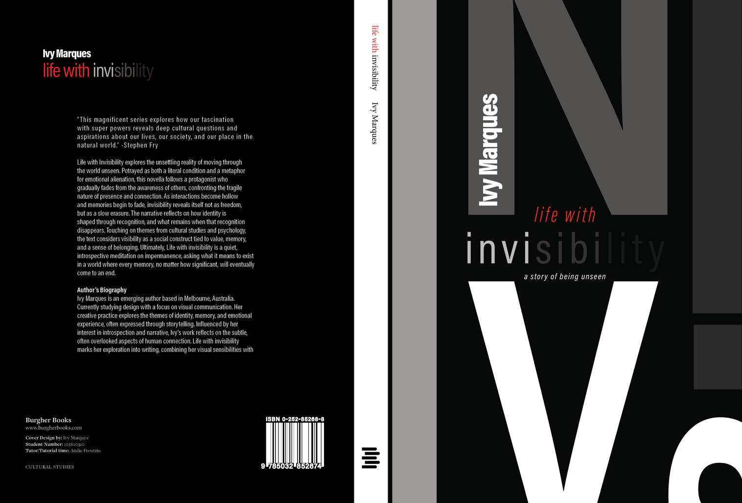
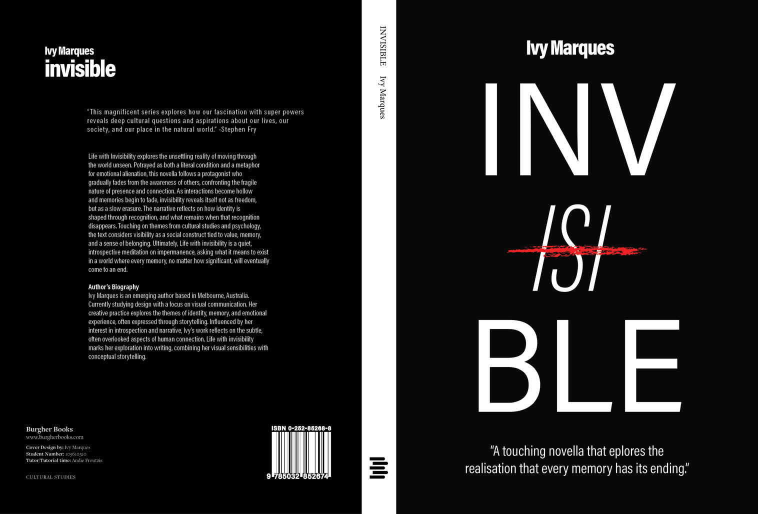
For my approach, I explored how invisibility could be communicated conceptually through typography and composition. I experimented with the weight, scale and style of the Acumin typeface, while creating a balanced layout that directs attention toward the centre of the cover. I gradually lowered the opacity of the word “invisibility” to create a typographic metaphor for fading and disappearing. I also experimented with scale and letterforms to strengthen the visual hierarchy, while keeping the overall composition minimal and avoiding unnecessary clutter.

Concept 1 - Final Outcome

Concept 2
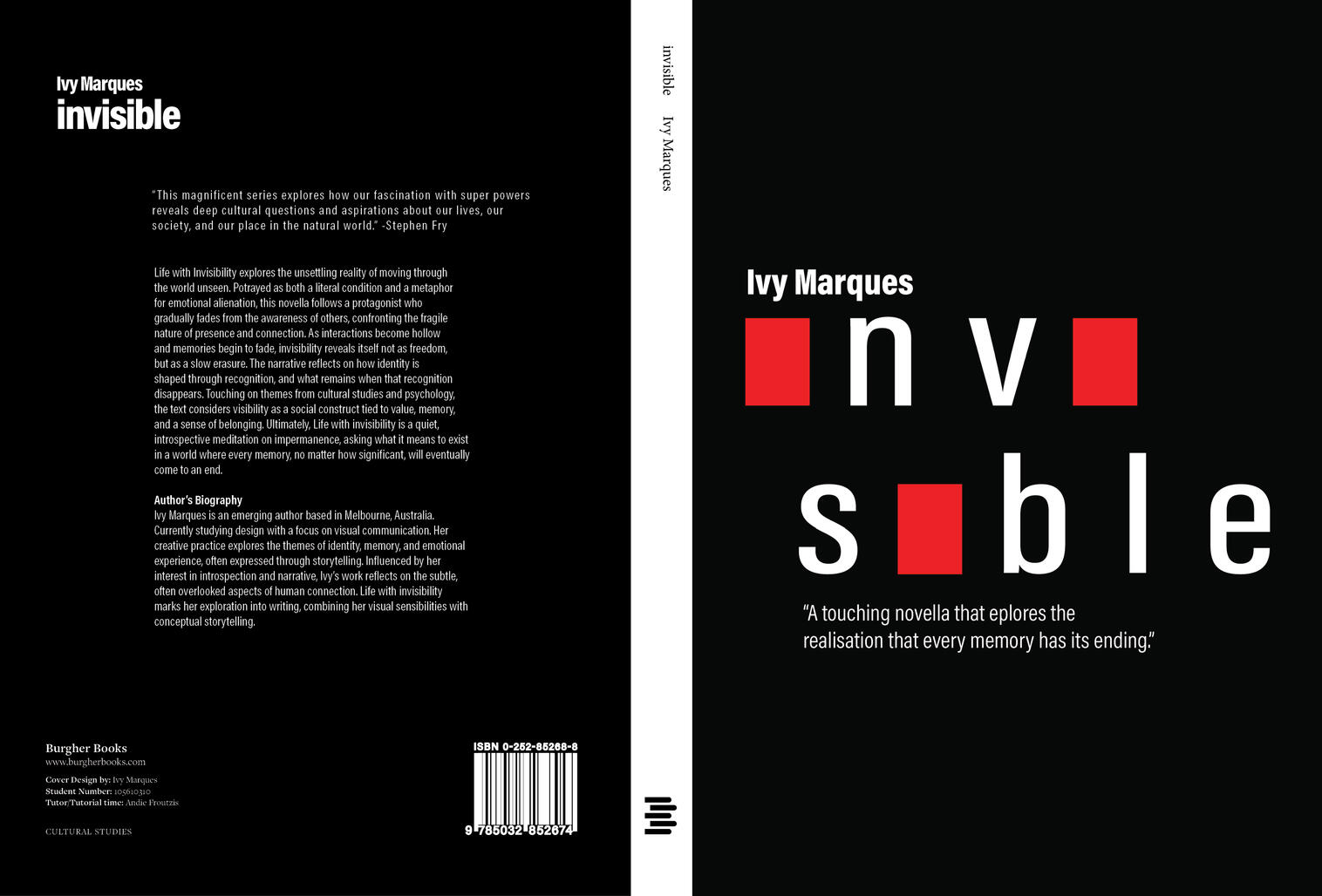
Concept 3
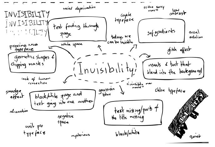
Brainstorming Concept - Invisibility
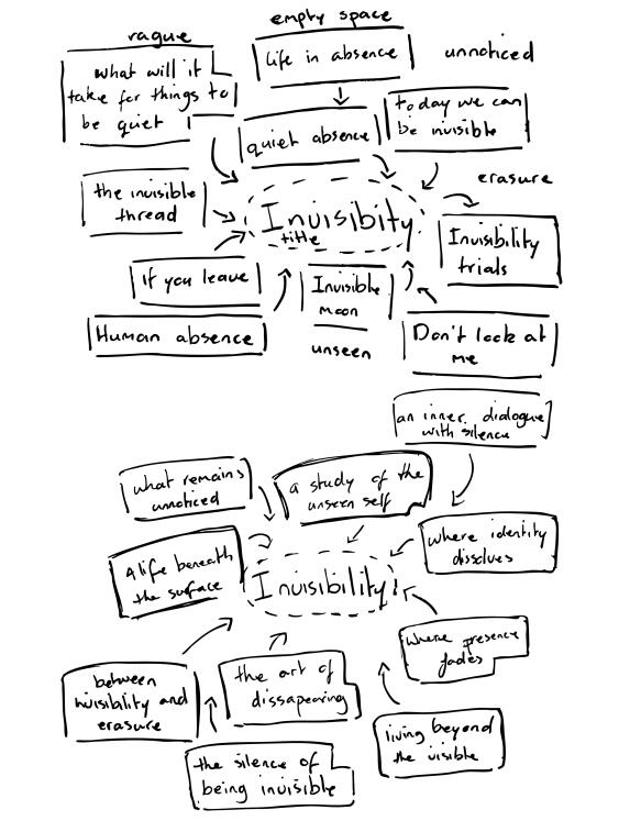
Brainstorming Cover Concepts
Communicating Chaos
The Brief
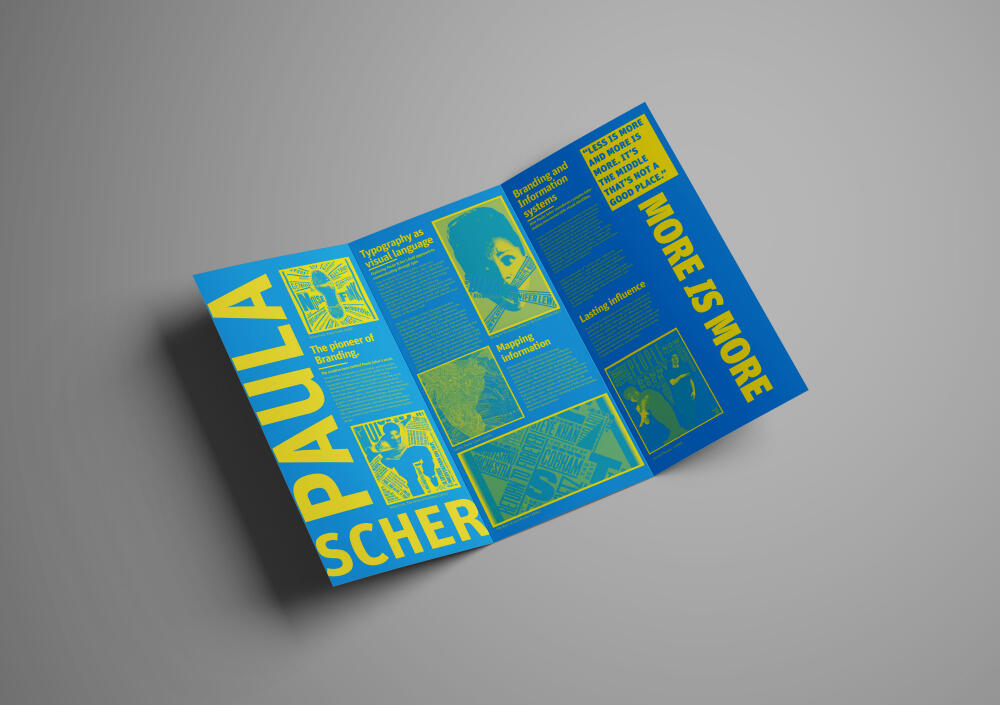
Design a tri-folded brochure that tells the story of a chosen designer and showcases key aspects of their work, created to appeal to a contemporary, design aware audience.My Approach
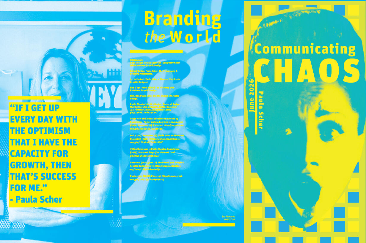
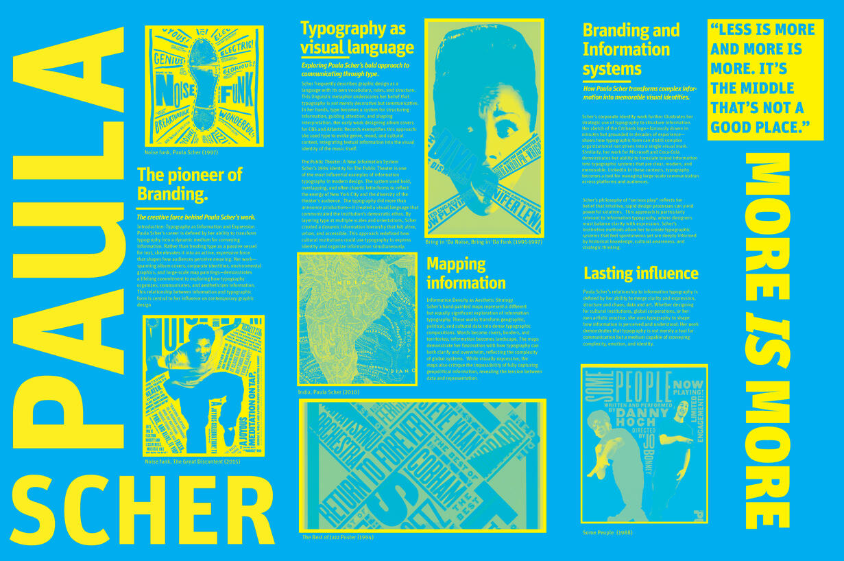
I designed Communicating Chaos to reflect Paula Scher’s bold approach to typography and information design. I used a contrasting blue and yellow swatch palette, large scale typography and a structured grid to create a bold and balanced composition. Unit Pro was used throughout, with variations in scale, weight and alignment to establish hierarchy and guide the reader. Grayscale photography and examples of Scher’s work were incorporated to provide visual and biographical context while reflecting her expressive design style.

Front, Back and Inner Fold

Inside Fold
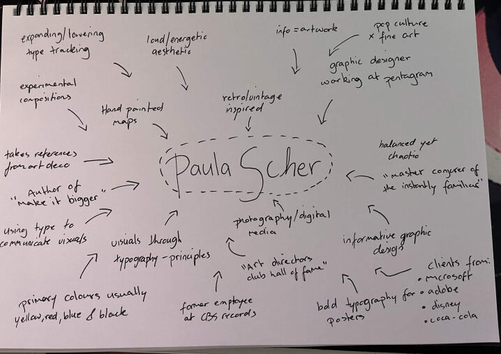
Brainstorming Concept
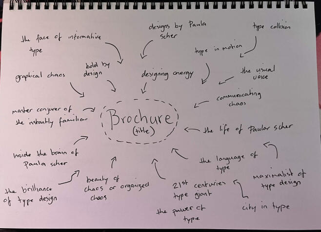
Brainstorming Concept Names
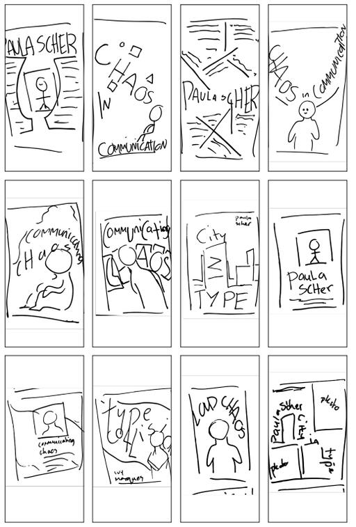
Thumbnail Sketch Exploration
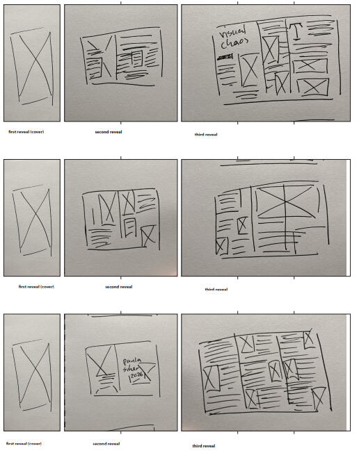
Layout Development Sketches
WhiskerBrew

The Brief
Design a unique packaging concept that challenges conventional product ideas through branding, structure and visual communication. The final design should consider its target audience, functionality and overall brand identity.My Approach
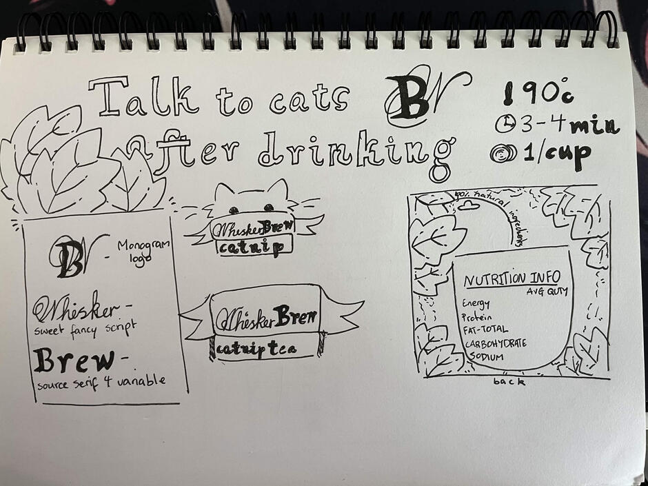
I developed WhiskerBrew, a playful tea concept designed for humans to communicate with their cats. I created a warm, nature inspired identity using earthy greens, contrasting accents and a combination of serif and script typography to balance playfulness with a premium feel. The packaging structure was designed to hold individual connected teabag sachets, while illustrations of human and feline interaction reinforce the imaginative concept and emotional connection behind the brand.

Final Outcome

Logo Concept 2
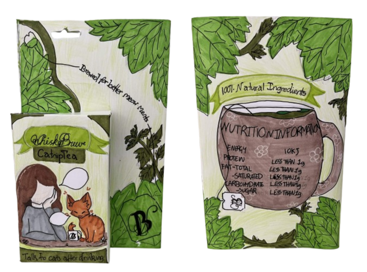

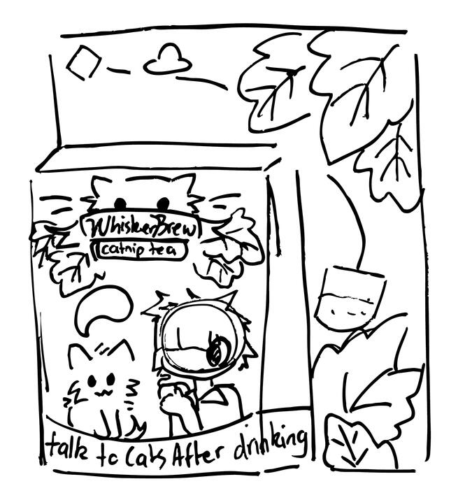
Front
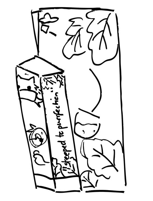
Side
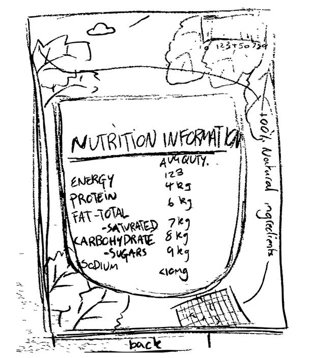
Back
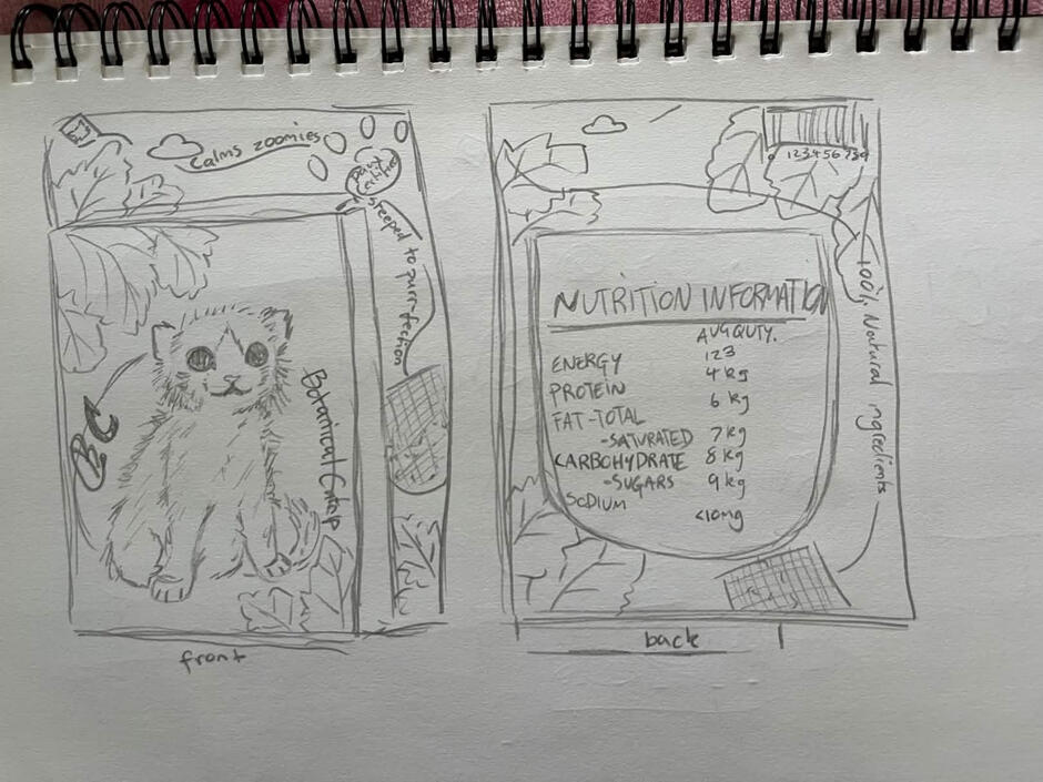
Thumbnail Sketches 1
Thumbnail Sketches 2
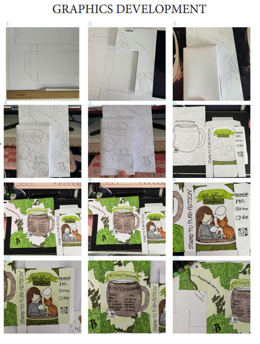
Graphic Development
Selected Projects

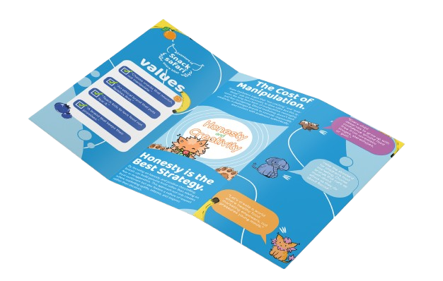
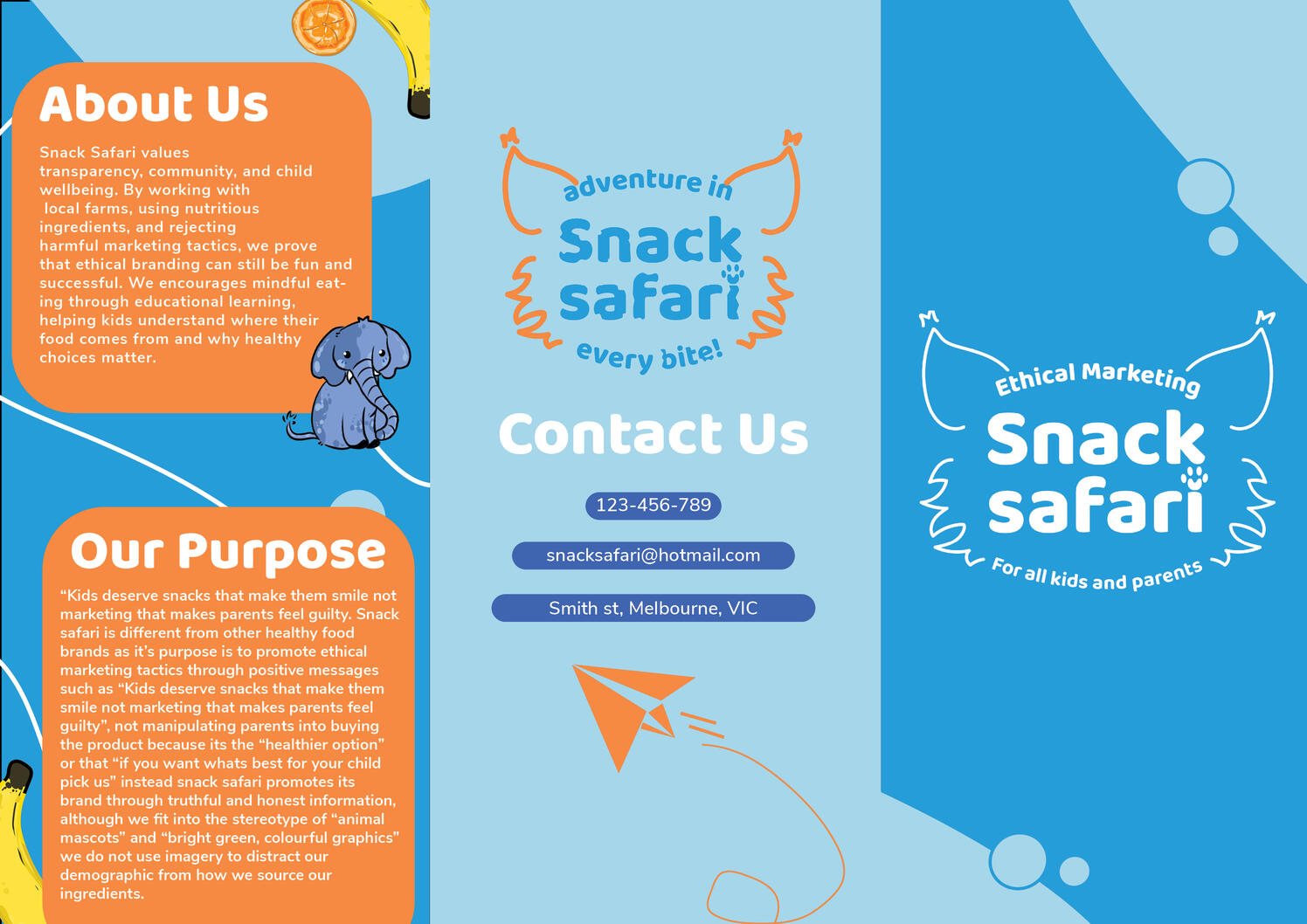
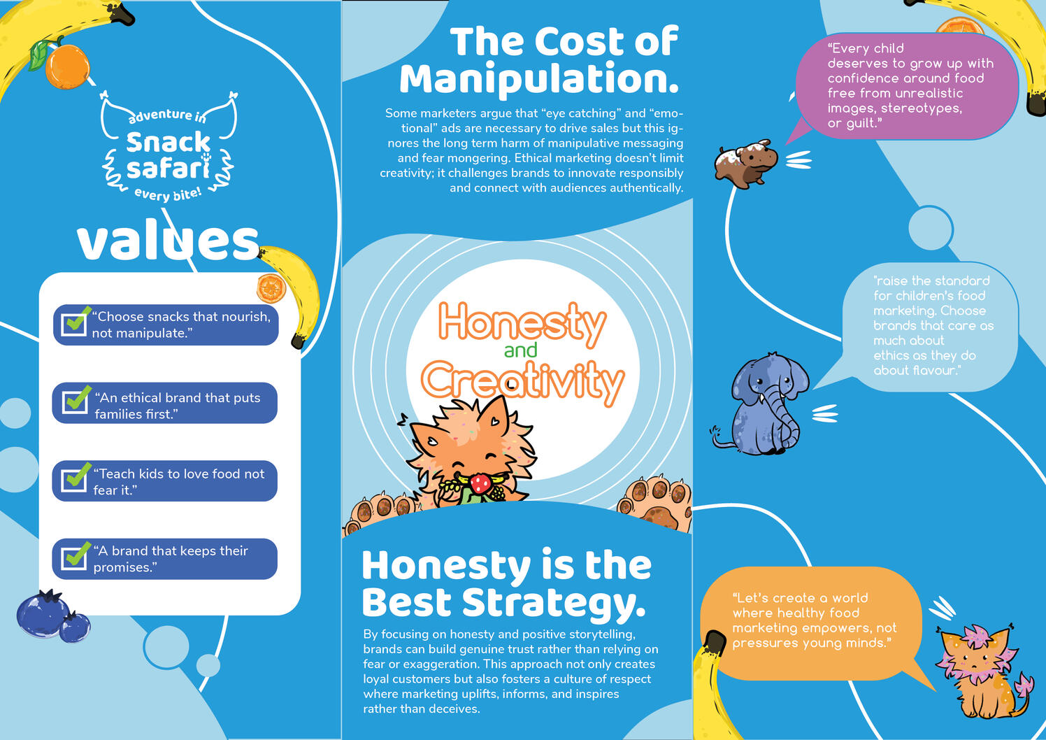
University Assignment - Snack Safari Brochure

I created Snack Safari, a healthy children’s snack brand featuring snacks shaped like safari animals. My goal was to make healthy eating more enjoyable for children while designing the brand identity, logo and promotional brochure materials.

I created Snack Safari, a healthy children’s snack brand featuring snacks shaped like safari animals. My goal was to make healthy eating more enjoyable for children while designing the brand identity, logo and promotional brochure materials.

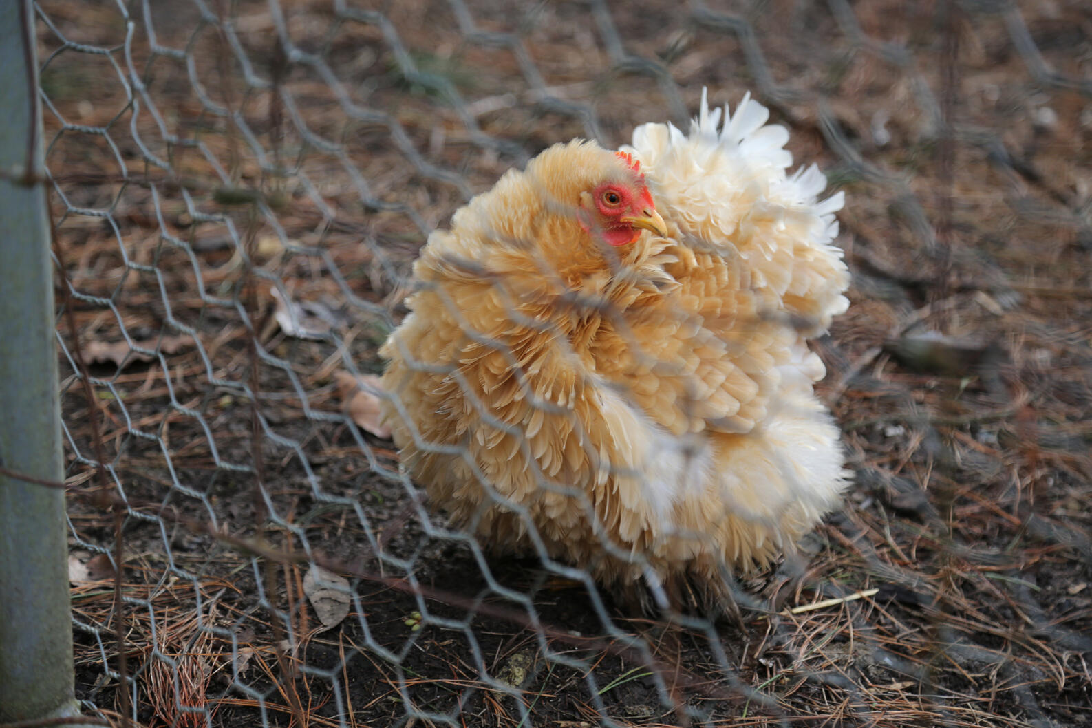
Photography: Shot on Cannon EOS Mark III

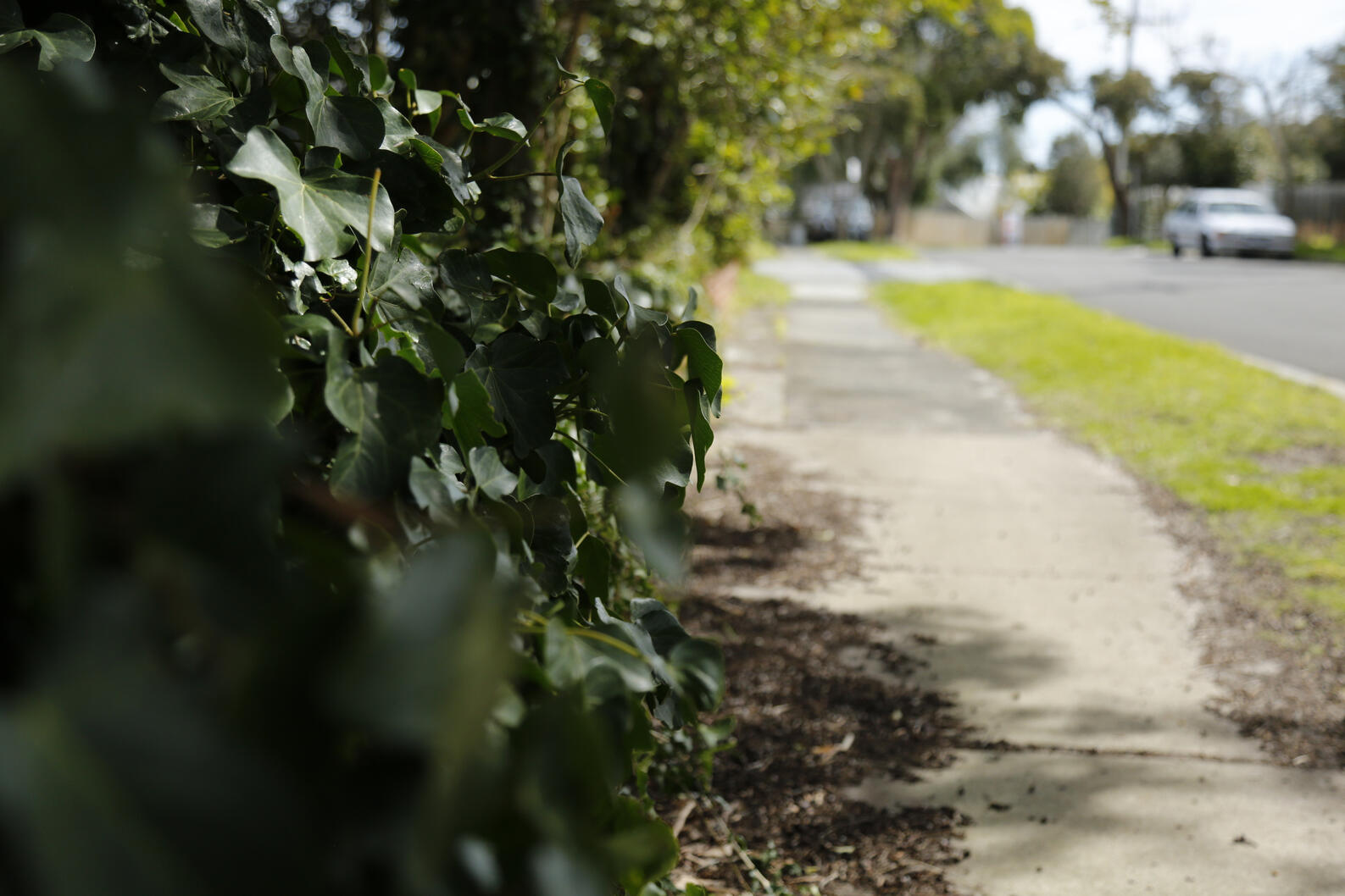
Photography: Shot on Cannon EOS Mark III

Photography: Shot on Cannon EOS Mark III

Black Cat: Symbol made using Lino Print & Graphic Marker

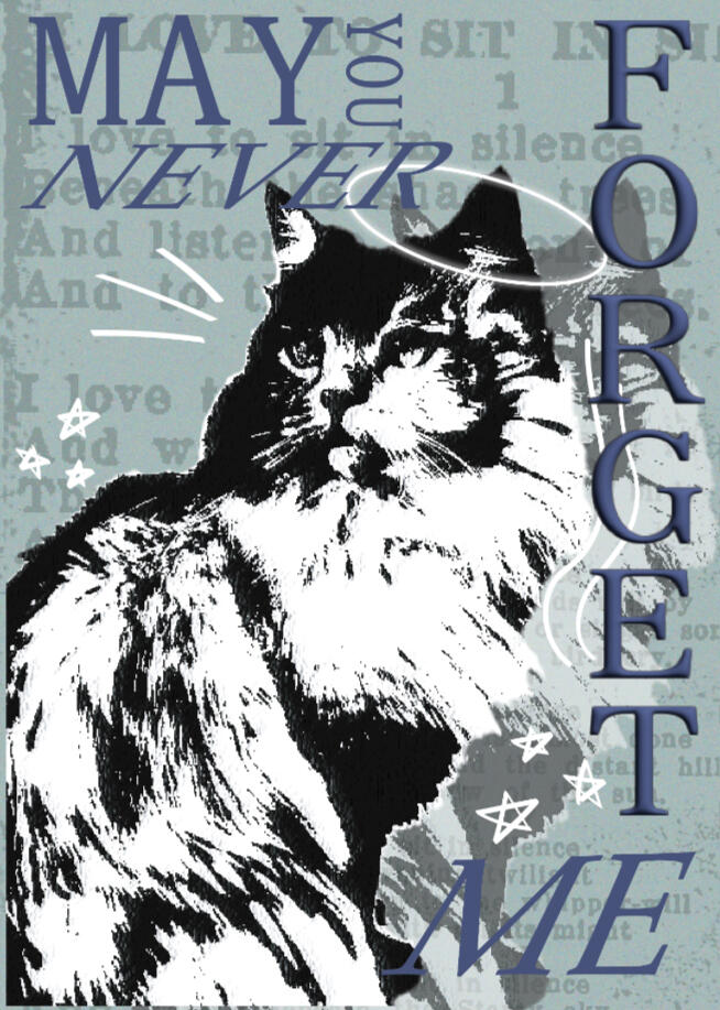
Personal Project - Poster 1
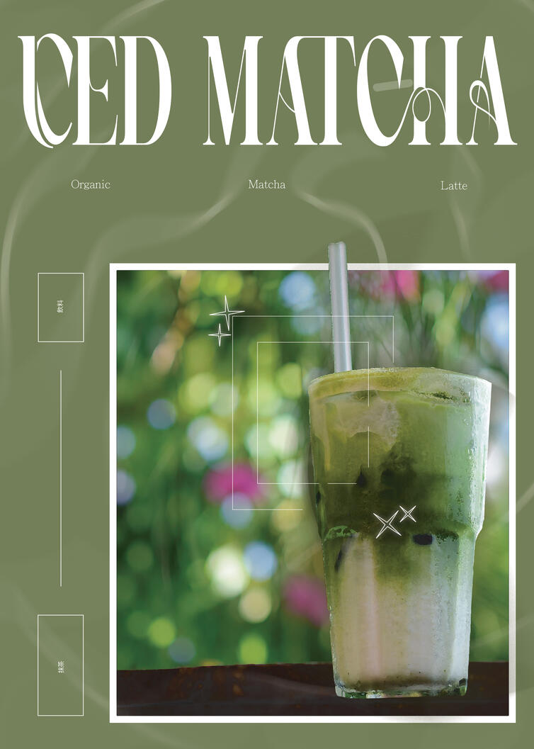
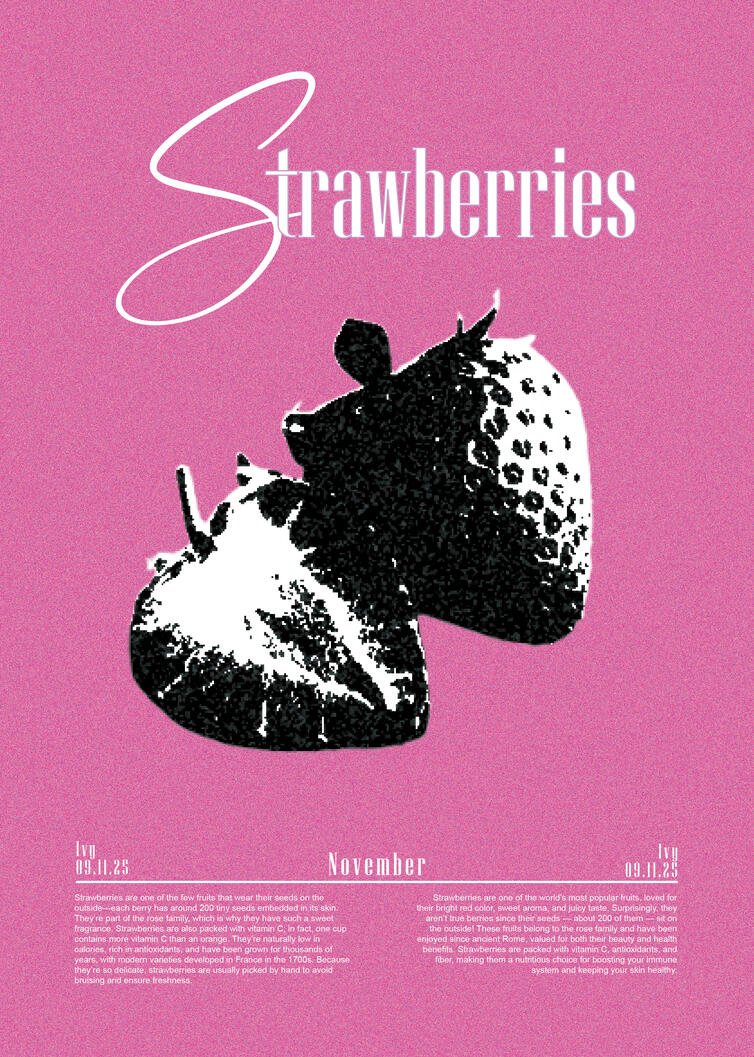
Personal Project - Poster 2

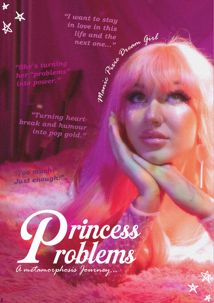
Personal Project - Poster 3

Personal Project - Poster 4

Contact Me
Please contact me directly or by using this contact form.Thank you so much for considering my Portfolio,
I look forward to the opportunity to work with you!